
Magazine Cover
Magazine Cover
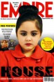
I have used 'EMPIRE' for my magazine cover. I used this company because it is a well-known company that will get my magazine lots of viewers.
I place my primary image on top of the 'EMPIRE' logo. I did this to signify that the magazine name is well-known that even if there is a picture on top of the name, people would still be able to recognize and know what it says. For my main image, I used the child from my film and placed her right in the middle of my page. This is to draw attention to the viewers because the picture is big and strong. I also did this because after looking at other 'EMPIRE' magazines, I noticed that they do this quite often on their magazine so I decided to do it as well.
For the colours of my magazine, I used black, yellow and red. I did this because the colours work well together. Red connotes danger, evil, blood and anger while black also connotes evil, darkness and impurity. The colours work well because they have the same negative meaning behind it which benefits my magazine as the film featured is a horror film. The colour red also stands out in a crowd of magazines so I think that it will catch my audience's attention. I have also added the colour yellow because the magazine needed one more colour to balance out the final outcome. I chose the colour yellow because it worked well with red and black and the colour really stands out and grab people’s attention.
I used a child for my primary image instead of the other, older character in my film. I did this because I think that it would grab more of the viewers’ attention as it is unlikely for a young child to be doing covers of horror magazines. I also got her to wear read to match the colour scheme of my magazine as well as making her eyes dark and her lips red. I edited the picture in Photoshop by changing the curves and levels on the picture to make it look less flat.
I have used the same font on the cover to make it look professional and pleasing to look at because using a lot of different fonts will make the page look too busy.
I used exclamation points on some of the features to catch the viewers’ attention because it shows excitement and enthusiasm. I have also included small pictures of the free posters as my secondary images to show them what they will be getting.